41 - Years Of Being Awesome


Alhamdulillah, puji dan syukur kepada Allah S.W.T. yg masih mengurniakan denyut nadi dan hembusan nafas seorang hambanya ini sehingga ke usia 41 tahun ini. Setiap tahun adalah perjalanan yang panjang, setiap tahun adalah pengalaman yang tak akan berulang, semoga setiap dugaan dan ujian menjadikan aku lebih matang dan dewasa, semoga setiap rezeki dan ganjaran tidak membutakan mata dan jiwa aku sebagai seorang hamba.

Buat saudara dan rakan2 yang masih sudi memberi ucapan dan doa untuk diri ini, semoga Allah S.W.T memberkati diri kalian seperti juga doa kalian kepada diri ini. Terima Kasih

Dengan usia baru ni azam terkini untuk menghidupkan semula blog yang lama berhibernasi ini... InsyaAllah.

New Start


 wait for it !!!

Teratak sepi yang berpenghuni ...


Assalamualaikum ...

Teratak ini sudah lama sepi ... biarpun sepi tapi masih berpenghuni. Terlalu sibuk dan tiada idea pun satu masalah jugak dalam perkara nak maintain blog bebel aku nih.

Walaupun sepi, tapi sepi itu satu pengalaman, byk yang aku lalui dari yg manis kepada yang sedih, semua dugaan dari Allah S.W.T kepada aku yang bergelar hambaNya.

Seminggu dua ni terpikir dan ada semangat semula nak membebel dalam blog rojak aku nih setelah lama sepi dan memendam idea. Nak mula semula adalah satu yang sukar setelah lama blog ini sepi. 

fikir ... fikir dan fikir ....

Sebuah Teratak Sunyi ... menanti tiba inspirasi.


Teratak blog aku ni dah lama sunyi, jarang posting dari tuannya digubah pada dadanya .. Harini seorang rakan bertanya, tak ada ke survey bufet ramadhan, yang ada dalam list ni pun list yang tahun lepas. 

Sejak pemergian ayahanda tersayang aku mcm takde inspirasi untuk mengomel di dalam blog ni. Tapi pertanyaan mudah dari rakan ku tadi membuatkan aku terdetik satu idea untuk kembali ke blog ini dgn idea untuk terus berblog lg selepas ini. 

Harap-harap apa yang aku fikirkan sekarang  ni dapat aku realisasikan ke dalam blog aku ini dalam masa terdekat ini dan masa-masa akan datang untuk kelangsungan kemerapuan aku di dunia maya ni.

Adiosss


SEMANIS AROMA BUFFET RAMADHAN


Tak tahu kat mana nak berbuka hari ni ??, minggu ni ??, atau teringin nak cuba berbuka secara buffet ?? ... hotel-hotel semua mahal terbabas nyer harga sampai beratus-ratus ringgit ?? ... jadi kat sini aku nak mencadangkan supaya korang cuba SEMANIS AROMA BUFFET RAMADHAN di Universiti Putra Malaysia Banquet Hall. Tahun lepas buffet ni dibuat di dalam kawasan MAEPS Serdang tapi tahun ni diubah tempat ke Dewan Banquet UPM ni yang lebih luas dan selesa dan mudah untuk dicari lokasinya.

           "Semanis Aroma Buffet Ramadhan"


Harga mmg berbaloi kalau nak banding dengan buffet-buffet Ramadhan di hotel-hotel memang jauh beza murahnya, kalau kat hotel sampai beratus-ratus tapi di sini untuk Dewasa RM 49.50 NETT! Kanak-kanak RM24.50 NETT (7-12 tahun). Bawah 6 tahun FOC (Free Of Charge)! Kalau buat tempahan untuk Pakej berkumpulan 10 pax ke atas akan dapat lagi diskaun 10%. Dengan harga tu korang akan disajikan lebih 200 jenis menu antaranya KAMBING PANGGANG, BBQ dan 15 warung pelbagai menu, boleh rujuk menu kat poster di atas. Makan lah sampai korang tak leh bangun pun takpe, sebab semua tu adalah buffet ALL YOU CAN EAT hehehe ...  tapi dalam bulan Ramadhan ni bawa-bawa ler bersabar bila tengok makanan tu yer hehehe ...

Selain tu yang membuat kan aku suka ke sini adalah untuk ke sini bila hampir dengn waktu berbuka tu tak perlu harungi jalan yang sesak, lokasi memang strategik dan privacy dengan ada security guard lagi nak masuk ke kawasan ini, siap dengan servis VIP lagi, kawasan parking pun luas dan dekat dengan dewan serta sambil menjamu selera pelanggan akan di sajikan dengan persembahan ghazal secara live ... memang best dan membuka selera. Dan yang paling aku suka ruang surau yang luas dan selesa, takde lah nak bersesak-sesak macam sesetengah tempat tu yang tak utamakan hal ni.

Jadi apa tunggu lagi, terus jer call dan buat tempahan guna nombor yang ada tercatat dalam flyers kat atas tu dan nikmatilah hidangan buffet yang enak bersama keluarga korang. untuk maklumat lanjut korang boleh juga layari page FACEBOOK mereka, klik jer kat sini ... 

What makes a good LOGO ?


What makes a good logo?
Principles of Effective Logo Design
What makes a good logo? A good logo is distinctive, appropriate, practical, graphic, simple in form and conveys an intended message.
There are five principles that you should follow to ensure that this is so…
An effective logo is (in no particular order):
  • Simple
  • Memorable
  • Timeless
  • Versatile
  • Appropriate

1. Simple

A simple logo design allows for easy recognition and allows the logo to be versatile & memorable. Good logos feature something unique without being overdrawn.
While in college in the mid-70′s an instructor introduced me to the K.I.S.S. Principle of design; which translates to: Keep It Simple, Stupid. It does convey a very important design consideration. Simple logos are often easily recognized, incredibly memorable and the most effective in conveying the requirements of the client. A refined and distilled identity will also catch the attention of a viewer zipping by signage at 70 miles per hour, on packaging on the crowded shelves of a store, or in any other vehicle used for advertising, marketing and promotion. Remember, the basis of the hugely effective international branding for the world’s largest shoe manufacturer is a very simple graphic swoosh.

2. Memorable

Following closely behind the principle of simplicity, is that of memorability. An effective logo design should be memorable and this is achieved by having a simple, yet, appropriate logo.
Surprising to many, the subject matter of a logo is of relatively little importance, and even appropriateness of content does not always play a significant role.
This does not imply that appropriateness is undesirable. It merely indicates that a one-to-one relationship between a symbol and what it symbolized is very often impossible to achieve and, under certain conditions, objectionable.Ultimately, the only mandate in the design of logos, it seems, is that they be distinctive, memorable, and clear.

3. Timeless

An effective logo should be timeless – that is, it will endure the ages. Will the logo still be effective in 10, 20, 50 years?
Leave trends to the fashion industry – Trends come and go, and when you’re talking about changing a pair of jeans, or buying a new dress, that’s fine, but where your brand identity is concerned, longevity is key. Don’t follow the pack. Stand out.
Probably the best example of a timeless logo is the Coca-Cola logo… if you compare it to the Pepsi logo below, you can see just how effective creating a timeless logo can be. Notice how the Coca Cola logo has barely changed since 1885? That is timeless design.

4. Versatile
An effective logo should be able to work across a variety of mediums and applications. The logo should be functional. For this reason a logo should be designed in vector format, to ensure that it can be scaled to any size. The logo should be able to work both in horizontal and vertical formats.
Ask yourself; is a logo still effective if:
  • Printed in one colour?
  • Printed on the something the size of a postage stamp?
  • Printed on something as large as a billboard?
  • Printed in reverse (ie. light logo on dark background)
One way around creating a versatile logo is to begin designing in black and white only. This allows one to focus on the concept and shape, rather than thesubjective nature of colour. One must also remember printing costs – the more colors used, the more expensive it will be for the business over the long term.
I like to work first in black and white to ensure that the logo will look good in its simplest form. Color is very subjective and emotional. This can distract from the overall design – say if you saw your logo in all red, that color may be the first thing that you respond to and not the composition of the design elements. I will not even consider submitting color suggestions to a client for review until they have signed off on a final black and white logo.
One should also familiarise themself with the commercial printing process so as not to come into printing problems further down the track. Learn to know the difference between the CMYK, Pantone and RGB color systems. When designing logos, the Pantone colour system is recommended.

5. Appropriate

How you position the logo should be appropriate for its intended purpose. For example, if you are designing a logo for children’s toys store, it would be appropriate to use a childish font & colour scheme. This would not be so appropriate for a law firm.
It is also important to state that that a logo doesn’t need to show what a business sells or offers as a service. ie. Car logos don’t need to show cars, computer logos don’t need to show computers. The Harley Davidson logo isn’t a motorcycle, nor is the Nokia logo a mobile phone. A logo is purely for identification.
For further evidence of this, take the top 50 brands of the world – 94% of the logos do not describe what the company does.
Paul Rand also has a say on this topic:
Should a logo be self-explanatory? It is only by association with a product, a service, a business, or a corporation that a logo takes on any real meaning. A logo derives its meaning and usefulness from the quality of that which it symbolizes. If a company is second rate, the logo will eventually be perceived as second rate. It is foolhardy to believe that a logo will do its job immediately, before an audience has been properly conditioned.


Source : www.justcreative.com 

What is a Logo ?


This posting going to be in English, so don't be amaze or playing stupid ok, it just sometimes I need to improves my English from time to time. I'll still be talking about our Independence day logo and how I don't like it at all, but 1st let us add up some more knowledge about LOGO from some website that i found.


What is a Logo?
A brand’s name is what the company or product is called. The tagline is a phrase or statement that says a little more about the brand than what the name can. The logo is the visual representation of these two and brings them all together.
There are 3 primary types of logos.
1. Text Only – A logo can be visually represented simply as text. This can be done with a readily identifiable font for branding purposes or even a plain font. The “Coca-Cola” logo with its iconic script font may be the crown jewel in this category. Another example is the logo for “IBM” with its plain font, but is creatively identifiable from the horizontal lines. 
2. Text Incorporated into Icon – These logos are characterized by the brand name being embedded into a recognizable icon (graphic symbol).


Two examples of this are:
a. Adidas, with its three stripes. The three stripes are iconic, but without “Adidas”, they’d be a bit lost on the consumer and likely difficult to identify.
b. Volkswagen, where the stacked “VW” are integrated into the seal/emblem, of which would be nothing without the letters.
3. Text with Option for Stand Alone Icon – A logo can and often does incorporate an icon or visual image accompanied by text. In extreme circumstances, this icon can have such strong brand equity that the icon itself can stand alone.
An example of this is Nike. The logo not only incorporates the text of the Nike name, but is accompanied by the recognizable swoosh icon.
Nike will even market the swoosh as a stand-alone image due to its incredibly strong brand equity.
Once the logo has been designed, the final piece is to incorporate the tagline, so a company can have two primary versions, with and without tagline.


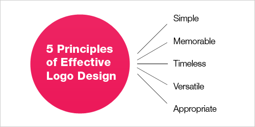
There are no rules in designing a logo. Fonts, icon design and color palettes lend to a great deal of creativity. Regardless, a new company developing their brand identity should take into account their brand’s personality and make sure that the logo design is a good fit.
The InStar Group believes that for a new brand starting out, the brand name should be incorporated into the primary logo for branding purposes. Not everybody starts out as strong as a Nike.
Ok, from the explainantion above we can consider our Independence Day latest logo can be categorized in the third category Text with Option for Stand Alone Icon, but in the next posting we'll try to go further try to find some more opinion about creating a good logo. TQ

Related Posts with Thumbnails